|
|
Post by trypticon on Aug 21, 2005 2:24:17 GMT -2
I've sent the following pictures in to be the new pictures for the PSO forum at GT. They will have to choose from the following: Scenic view 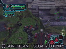 Lobby Witchcraft 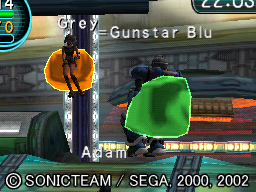 Shot from my signature  Brian and I at home base 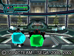 Snap of Alaina, Darin, and I 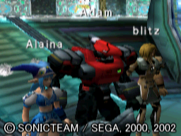 Mei Panda burrying her face into Hot and Juicy's tits 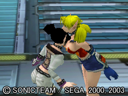 Autumn Wynds snap  or Mandy Blake snap 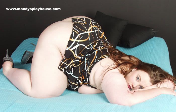 Which ones do you think would be best? Remember, there are four possible pictures per forum. |
|
sonicyouth
Junior Member
 I used to have a handle on life but it fell off...
Posts: 58
|
Post by sonicyouth on Aug 21, 2005 18:48:12 GMT -2
Yum. Those two would be a handful to cook for.
|
|
fucker
Full Member
 C: 0
C: 0
Posts: 107
|
Post by fucker on Aug 22, 2005 5:40:38 GMT -2
What the hell all of them are so crappy! Bad quality and all show your HP and online. You're meant to have clear pictures (i mean at least take the map off) plus its abit unfair to have you guys in the picture i mean the forum is for everyone and now that you became the mod is like you own the forum.
|
|
|
|
Post by trypticon on Aug 22, 2005 6:09:06 GMT -2
No way to take the map off pictures, sorry to break it to you.
I've barely posted in the GT forum since I was given the title, so it's not like I own the place.
The pictures are as clear as can be taken using the PSOdonut tool. I don't know how to use PSOproxy, and since I'm not online at the moment, I can't have somebody who does know how to use it take pictures. The only picture that isn't very good quality up there is the picture of Alaina, Darin, and I. The rest of them look fine. If any of these are going to be used, they will likely be edited further.
|
|
fucker
Full Member
C: 0
Posts: 107
|
Post by fucker on Aug 22, 2005 6:36:27 GMT -2
Well i just think they shouldnt be of your character and friends characters. We all play pso and they should be title shots like from websites. The old pictures didnt show any names of characters so they were fair.
|
|
sonicyouth
Junior Member
I used to have a handle on life but it fell off...
Posts: 58
|
Post by sonicyouth on Aug 22, 2005 14:45:49 GMT -2
Why does it matter if it shows names. They only mean something to us, no one else. Still Autumn Wynds has my vote. Possibly one of a boss fight or something. Not just showing characters lazy around or doing the wall glitch thingy.
|
|
|
|
Post by afridge on Aug 23, 2005 7:56:39 GMT -2
The shot from your sig is good. The others don't really seem to have much action... Especially the whale up there.
|
|
|
|
Post by trypticon on Aug 23, 2005 13:10:29 GMT -2
Which one?
|
|
fucker
Full Member
C: 0
Posts: 107
|
Post by fucker on Aug 24, 2005 4:07:16 GMT -2
Ok let me tell you why each and every picture sucks (And I'm not talking about the characters sucking just the fact that their in there and make's it unfair)
1.To dark, to much info on the screen shot Just a really crappy picture in general I mean the characters are facing the wrong way.
Picture 2: Boring, crappy looking, unfair.
Picture 3: It's a cool picture but its obviously favouring that character and player (mod). Plus RAcast's are the most unpopular characters online from what iv'e seen. And HUnewearl's the most (how annoying)
Picture 4: If i was forced to vote for one i would vote for this one because its a nice clear shot showing the lobbies online, and not favouring characters or players directly.
Picture 5: Blury, unfair.
Picture 6: Wouldn't make it anyway because it's rude.
Picture 7: To fat to fit in the tiny square spot.
Picture 8: Would have to take up the whole webpage and people might be confused and think you can choose a whale as a pso character.
Sorry if that offends anyone but it's the honest truth.
|
|